Space has been a dirty disciplinary word since about 1972, when architecture abandoned the worship the pedestrian-scaled Italian Piazza in favor of the spatial sprawl of Route 66, who’s landscape gave birth to the American Sign, and the Motorway Hotel. As disciples of Learning from Las Vegas, we began to understand how the form of the sign could operate spatially in the urban landscape outside of the building. The sign projects character, and in understanding its physiognomy, Bob + Denise began to deconstruct the signs of the motorway into the informational versus the heraldry. That which we see first from a great distance, the heraldry, is replete with applied imagery, symbols and logos invoking meaning, character and style enticing us closer, to sleep under its moons and stars. Upon closer proximity and inspection, we are supplemented with further qualifying information, yes/no vacancy, the promises of cable and movie channels, telephones and dare we say, wifi? The commercial ambition first establishes mood-form via the sign’s shape-logo, praying on our desires to be transported in this night of rest to another land that is an extension of our journey down the road.
/ Models
Sadly, this mood-form is left at the door, or more accurately the curb, as when we pass through the threshold of the envelope, and into the world of our new room, we are confronted with the generic promises we found in the realm of the informational with no mood. Our dreams have been shattered and met with the ubiquitous in the form of a bed, TV, phone, Gideon’s bible, and ( if we’re lucky ) some logo emblazoned wall-to-wall carpeting recalling the cowboys and horses galloping back and forth outside in neon along the highway. These became the Lessons of Las Vegas, a paradigm that has fixated a disciplinary gaze on the envelope obsessively for the past 35 years, with a complete and total disinterest in the project of the interior and the dirty word space. The surface-envelope fixation gave birth to the projects of decoration and figuration that adorn generic spaces or trap them as secondary within the iconographic or mysterious object withdrawing from the urban realm. The pavilion as a project, is an outgrowth of this post-modern infatuation with the Envelope, and as of late has turned to focus more on increasing levels of digital intricacy and indexical procedural articulation, in lieu of communication.
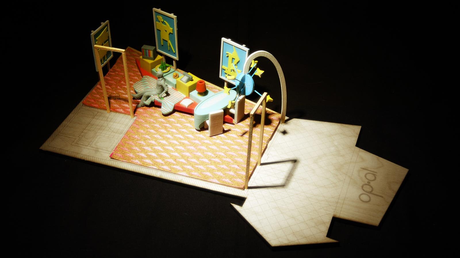
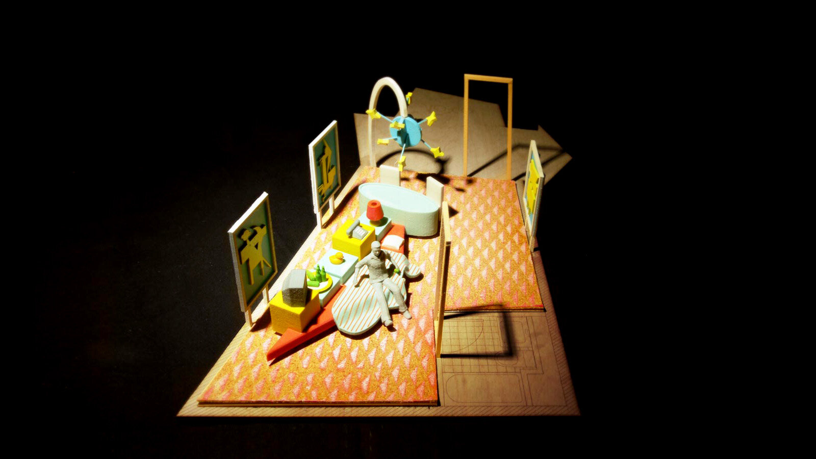
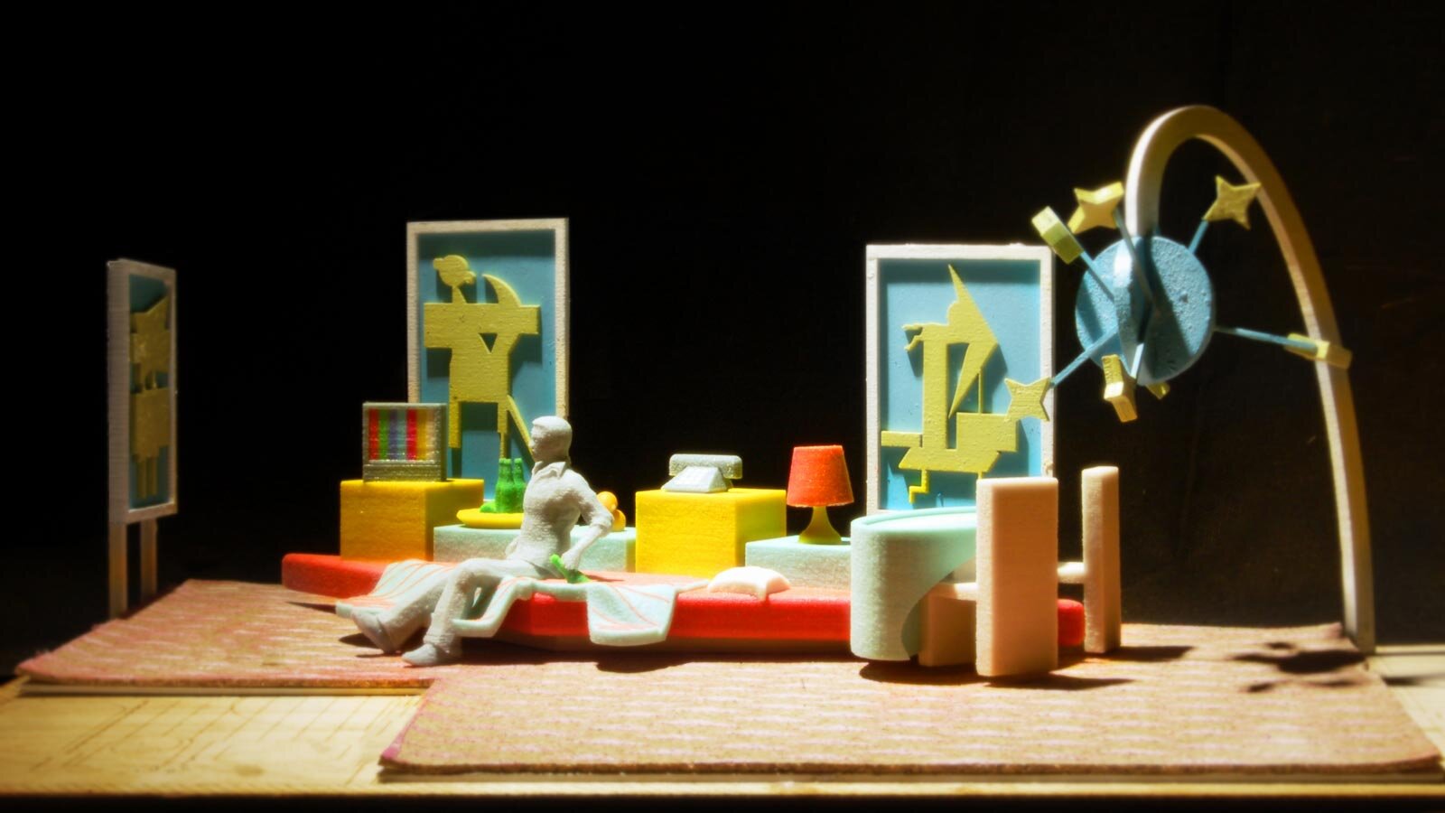
Our interest lie in the overlap of cultural mood and space, our proposed installation for the Holiday Lodge, is to merge the figural world of the Motorway logo with the spatial domestic interior to investigate the representation of form through materiality. Much like the Gaga Bow-hair of 2008, the adoption of recognizable figure re-presented through obscure materiality presents the possibility of cultural hybrid, between the cultural and the sex symbol and innocent child. Stripped of its literal typographic reading, we have re-appropriated these layered shapes, as a landscape for the stay of the wanderer, replete with the functional types, that we would expect from the interior. The piece, suggests that architecture need no longer apply the Lessons of Las Vegas, for the envelope but for an Inside-Out return to the spatial project. Our Proposal for the hotel is to create a spatial domestic furniture landscape for the hotel visitor in the spirit of the artist Andrea Zittel reinvigorated with mood of the communicative logo. Through the figural re-appropriation we hope to re-value it in its new context.
/ Collage
/ Project Team
Jonathan A. Scelsa, and Jennifer Birkeland
/ Project Info
/ Project Type - Installation Call
/ Location - Hotel
/ Project Date - 2017


